

Why glow fails
Glow is the most abused effect on the web. Most of the time it is a blurred shadow in a brand colour, stacked until it looks like a nightclub flyer. Real light behaves differently, and the difference is what makes a page feel expensive.
Falloff is everything
Light loses energy with distance. On screen that means a bright core, a short soft shoulder and a long, almost invisible tail. If your glow has one radius, it will always look painted on. We build every glow from three layers: core, shoulder and haze.
“If you can see where the glow ends, it is not light. It is a sticker.”
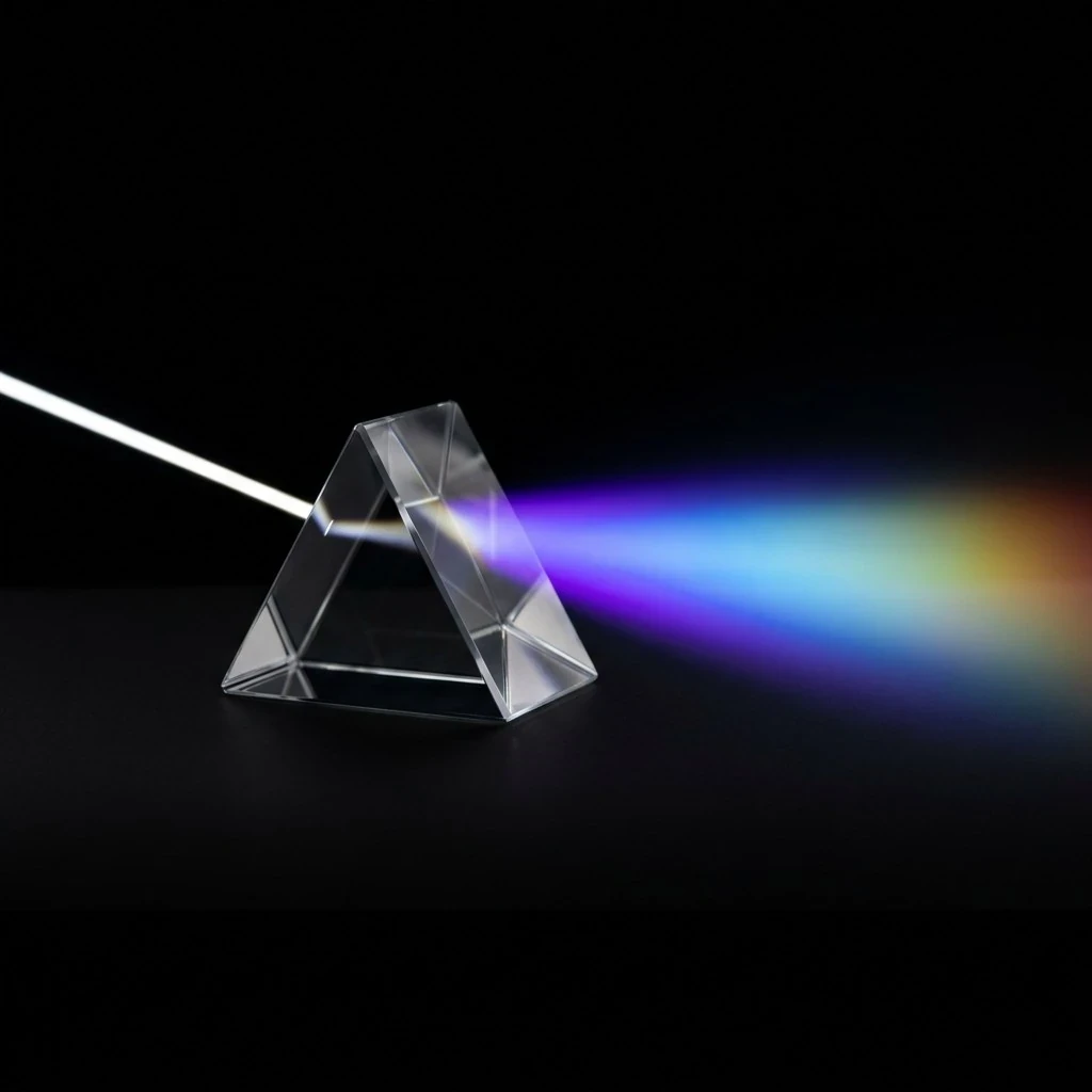
Fig. 1 · A prism shows the falloff we try to copy on screen
Grain makes light physical
Core: 4-8px, near white, 90% opacity
Shoulder: 24-40px, brand colour, 35%
Haze: 120px and wider, a cooler hue, 8-12%
Add a 3-4% monochrome grain above every glow and the gradient stops banding, the eye reads texture, and the light suddenly has a surface to land on.
Colour temperature
Real light is never one colour. We push the core of a glow towards white, the shoulder towards the brand hue and the haze one step cooler. That is why a violet glow reads as light and not as paint.
Restraint
One light source per screen. If everything glows, nothing does. Pick the single moment that deserves light, a headline, a product or a button, and let the rest of the page stay dark enough to make it shine.